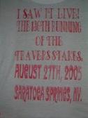
1
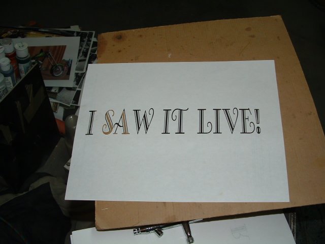
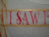
I'm not an avid horse racing fan. Since my clients are, I decided to use my airbrush talents to promote MY interests. Every year, the Travers Stakes is the biggest racing event of the summer, and I make a T-shirt to commemorate it, and give it away in a raffle to anyone that rents binoculars on that occasion. I REALLY dislike the traditional airbrushed lettering, and I'd much rather find a font that is unusual and cut a stencil. Here is the print before I cut it out.
| 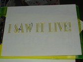
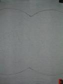
2
I place it over a green backgound so you can see where I've left certain aspects uncut.
| 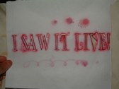
3
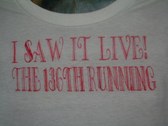
I place it over the center of the t-shirt and spray some transparent red thru the mask.
| 
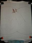
4
Now I run a line of tape above and below the letters, making it easier to align the next mask.
|
5
Some of it I try to fill in freehand, the results are only so-so. I'm starting to regret my choice of fonts.
| 
6
Here's the finished first lines. The bad thing aboutthis system is: that t-shirts stretch and move with the tape, so the lines don't always match up.
| 
7
I finish the main theme, but I decide to save myself some headaches by switching mid-stream.
| 
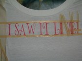
8
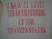
I go for some easier balloon letters. Since they're all the same color, the difference isn't so striking.
|
9
The front is done. Now I can move to my favorite part...the artwork!
This will be on the back of the shirt. Last year I did a more realistic racehorse. This year I break the mold and decide on a cartoonish image.
| 
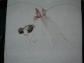
10
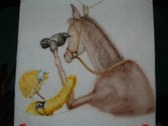
Since the binoculars is my angle, I don't want to make a blatant ad, but I DO want to include the idea of them in the picture.I use shading grey to do a thru-the-lens view.
| 
11
Now I start my ofbeat idea. The horse comes before the cart.
| 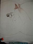
12
Guess what, he's watching the race thru a pair of binos.
|
13
I prefer to use one color at a time, but since there will be some overlapping, it's better to not get too ahead of myself.I do the details of the field glasses, before moving on to more of the horse details.
| 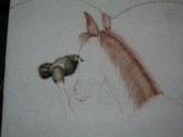
14
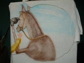
Now I start to fill in the mane.I switch between the grey and brown. The grey will darken it so I won't have to mix too many colors to keep them separate.
| 
15
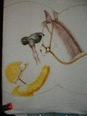
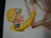
I put the tack on the star of the cartoon and next I add the jockey.
| 
16
Now that I've established where the jock is, I can finish off the horse.
|
17
I'm tempted to add a lot of the musculature, but it's not a real life drawing, so I fight the urge.
| 
18
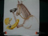
Now I add the skintones of the rider, the plastic lenses of the goggles, and his number.
| 
19
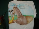
I could overwork this one real easily, so I force myself to leave it alone and add the background.
| 
20
A blue sky, some green grass, a darker green hedge and the dirt track course, I'm close to calling it done. I add the humorous angle, with some freehand lettering.
|
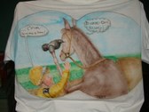
21
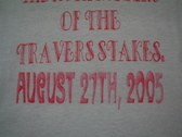
Here's the finished product. Click on the image and it will be easier to read what they're saying/thinking. I just realized, that when I first sized the lettering, I made them too big and when I resized, I put the WRONG number in. It's the 137th running of the Travers. Beat me with a "Duh" stick!
"Hey, Fun! How do you dete..."
View Comments...
| |