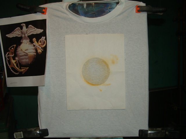
1
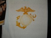
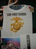
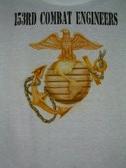
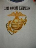
The Marine Corps Emblem is easily recognized so I'll use that on the front of the T-shirt. My Dad has a thing against wearing tees that are any color other than white. That's fine with me, since they're the easiest to airbrush on. I start with the globe by making a round circle template. The emblem is a goldish color so I spray a light mist thru it. I can always darken it later.
| 
2
Next I paint the eagle on top. For some reason this bird isn't as majestic looking as I think it should be, but I don't want to use one like those that appeared in Nazi propaganda films, so I stick to the original.
| 
3
I darken some of the features to help make it look less flat.
| 
4
Now I start the anchor that pierces the Earth.
|
5
I leave enough space to allow me to put the chain/rope that secures it later on.
| 
6
Now I fill in the continents. The image on the emblem isn't all that precise, so I copy it as it is, NOT as it should be.
| 
7
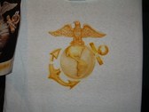
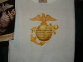
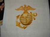
Now I put in the bands, and add more shading using a darker tones to help keep the logo looking spherical.
| 
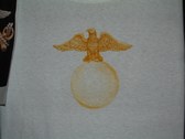
8
A closer view.
|
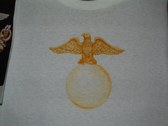
9
A wide shot where you can see all the reference pictures I use. I was getting tired of the yellow tones, so I added the name of my Dads' unit, using a stencil.
| 
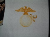
10
I still am not sure if that is supposed to be a chain or a rope, but I recreate it as closely as I can. It has a darker, more silvery tone to it.
| 
11
Although it's not as metallic looking as I had hoped, I will leave it alone. Trying to improve it at this point, will only make it look muddier. Now I flip it over and work on the back...
| 
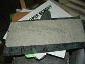
12
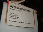
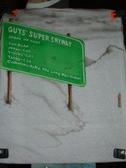
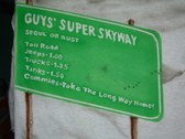
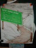
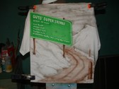
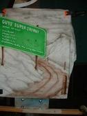
My father was a combat engineer, building roads. Trucks were forced to drive with hooded headlights, to make them less visible to snipers and artillery spotters. On mountainous roads, this made driving very hazardous, so my dad took the lids off c-ration cans and tacked them to posts, creating rudimentary reflectors. Many drivers commented how this made travel safer, and my Dads' commanding officer got a commendation for it. This didn't sit well with the enlisted men, so they named the road after my Dad. I printed out a sign on paper, hung it on my easle and rephotographed it, so I could get the angles of the lettering more accurate. His outfit took a lot of ribbing for never making it into the Capitol, hence the "Seoul Or Bust" notation.
|
13
I took the second sign and placed it atop some masking tape spread over a sheet of acrylic, transferred the lettering and started the arduous process of cutting it out.
| 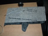
14
Cutting out a negative stencil is tedious work, but I'm not good at lettering, so it pays off for me. Here's what the cut-outs look like after removing the positive pieces.
| 
15
I know it's hard to see, but here's the lettering taped onto the shirt. Believe me, it's not easy to align them without using some sort of straight edge.
| 
16
Now I mask off the surrounding shirt, with the paper that I used for the sign. Waste not want not. I also put on a surround using masking tape.
|
17
Now I spray it green, to mimick the highway road signs that decorate modern highways.
| 
18
I have to weed-off the individual letters, but prior to that, I add some detail to the area around the sign.
| 
19
A closer look. Some cold war humor.
Despite my efforts, the lettering still looks crude and uneven. Clicking on any of the shots will enlarge them, making them easier to read.
| 
20
I was going to paint the sky blue, but I remmeber the tales of the brutally cold winters in Korea, so I make it a foreboding grey instead. I also put in the posts with the "reflectors".
|
21
Some ruts in the road and a few bullet holes in the sign, to make it a bit more obvious that this is a war zone.
| 
22
A few more final details and I'll call it quits before I get obsessed with minute details that won't enhance the artwork any. I hope Dad likes it, I finished in time to get it in the mail for the Marine Corps Birthday on November 10th.
| |