1
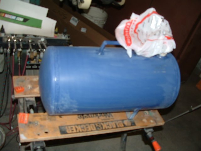
A portable air tank that I bought at Wal Mart was too boring for my liking, so itz time to customize it. I gave it a sanding with 320 grit wet/dry paper, then a second sanding with 600, just to knock down the gloss and give my paint something to grab onto.
| 
2
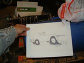
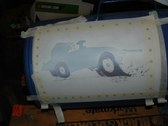
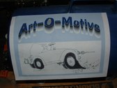
Here's a sketch of my design, which I'll use as a stencil. It's a sketch of an airbrush morphed into a roadster, stealing styling cues from a '32 Model A.
| 
3
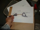
I back it up with a piece of cardboard and cut it out with an Xacto knife.
| 
4
Here's the negative stencil. When you spray into a void, it's a negative, spraying around something to block off the paint makes a positive stencil. I keep the cut-out in order to use it as a positive after I lay out my outlines.
|
5
I use a hole puncher to circle my stencil so tape will hold it firm. This was a trick that I thought I had come up with, but I recently saw Craig Fraser use it in one of his articles, and I doubt an artist of his stature would be looking at any of my work, so I'll just pass it off as "great minds thinking alike". On a curved surface it's not easy to get a mask to lay flat, and this gimmick helps.
| 
6
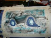
I'm using Auto Air paint, which is famous for not flowing smoothly, so I rely on masking to keep the details sharp. I also like to use the mask as a place to test the spray pattern before I start on the article being painted. That accounts for the mess you see before you.
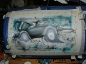
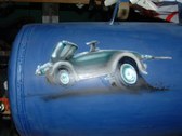
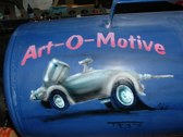
| 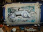
7
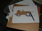
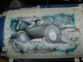
After getting the basic shape of the Airbrush/roadster, I add the running boards. I'm keeping the colors I use to a minimum, since I'm anticipating problems with the paint.
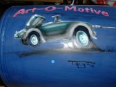
| 
8
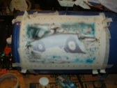
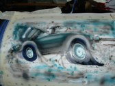
I shade heavily on the underside, to emphasize the cylindrical shape.
Airbrushes are chrome, but I use a lot of blue as if it's reflecting the surrounding colors of the tank. Once I peel off the mask, I'll see if this paid off or not.
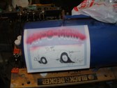
|
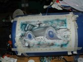
9
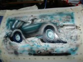
It looks dull in the pix, but with some highlights it'll come alive.
| 
10
Having no luck with the Auto Air. I switch to Golden paint to see how that works in these conditions.
| 
11
I use white paint here and I'll see how it holds up vs. the A.A.
| 
12
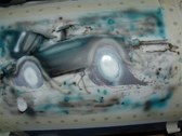
Since the wheels are supposed to be spinning, I don't have to put too much emphasis on the details. However, I do want to make them look like chrome.I mix some cerulean blue with shading gray and start to spray the upper portions dark, since they're in the shadows.
|
13
Having done both wheels, I remove the paper covering the tires.
| 
14
I spray them shading gray, this can be built up to look almost black, but I want to do some details to indicate treads, so I don't go too heavy.
| 
15
Now I spray the gaps between the fenders and tires carbon black. This is much deeper than the gray, although it's hard to tell in the photo.
| 
16
Now I remove the paper. I discover that I put the mask on before the adhesive had gotten tacky, so I'm stuck with the daunting detail of removing the adhesive without removing the artwork.
|
17
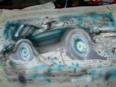
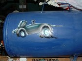
Now I add some shadows under the airbrushmobile, and the chunks of tire from the burn-out it's doing.
| 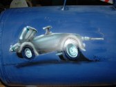
18
I make the traction bar look chrome so it stands out a bit.
| 
19
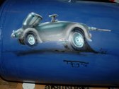
I add some streaks to give the illusion of motion and then my signature, a sure sign that I'm almost done with this portion of the project.
| 
20
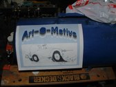
I cut out a name I used to use back in the '70's when I was painting custom vans. I secure it to the tank, making sure that I don't use too much adhesive.
|
21
I fill in the gaps in the A The O's and the E with masking tape.
| 
22
First I sprayed a coat of white then went over it with transparent red. I lay it on heavier at the bottom, to give the lettering some depth.
| 
23
Here it is as it stands. Not much more to go.
| 
24
I want to have the lettering with long shadows that run to the horizon line. So I put the blue dot underneath as my reference point.
|