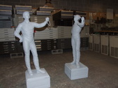
1
Last year I was stuck painting the "silks" of some of the more prominent racing stables at The NYRA tracks. This year I've got to paint six 'virgin' lawn jockeys. These are cast aluminum and the quality is rather poor. If I were preparing these for a paying customer of my own, they would require quite a bit of prep work to make them more presentable. Since I'm not getting an artists fees, the prep work is out the window!
| 
2
I hadn't expected this task to fall into my lap, so I didn't bring my camera along with me. This is the first jock I started. The paint I'm using is for lettering and pinstriping. It is solvent based and very slow drying. This makes it difficult to do rapid work, since I'm constantly worrying about smearing or rubbing off the wet paint from previous steps.
| 
3
While waiting for the paint to dry, I'll do the easy parts of the other figures. I know the colors of the pants, boots and bases so they'll be done assembly-line style.
| 
4
I don't have any flesh colored paint so I had to mix some up from what I've got on hand. I'm satisfied with how it looks.
|

5
There are small dents where the pupils of the eyes are, and when paint is put in them, the joeckyes look cross-eyed. I'll try my best to disguise that.
| 
6
The arsenal of brushes I've got isn't quite so precise, so the irises aren't where I'd like to have situated them.
| 
7
The two other figures look like they're prancing around in their tighty whities.
| 
8
The first one is a design I had done last year, so it's not a big deal to put in the details. Since the surface isn't smooth, it can be frustrating to make it look real and still be legible.
|
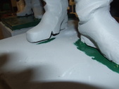
9
These statues are full of defects. This doesn't point to good quality control of the place in Mexico that manufactured the figure. Look at the gap in this guy's foot!
| 
10
The seams aren't welded closed either.
| 
11
Moving along in my assembly line process, I got paint on the lower halves of these riders.
| 
12
I managed to complete this one, but the lettering is a bit askew. I have to wait for it to dry before I can correct it.
|

13
Here you can see where I used chalk to set up my letter. This is a good medium, because it doesn't keep the paint from adhereing, it's very visible and it will easily wipe away when I'm done.
| 
14
Here you can see how the R is a bit lopsided.
| 
15
The back came out better, because the surface was more forgiving.
| 
16
This guy's silks are all white, so he's looking a bit like a ghost.
|

17
I fixed the wonky looking R after the paint dried. This one is ready for some clearcoat.
| 
18
This one is a drag because his whole outfit is white. The star logo is rather precise, but I'm going to freehand it on him and hope for the best.
| 
19
The green is in the center, so I'm doing all of those portions first.
| 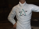
20
The black "wings" come second.
|

21
The line in the center is a bit lower than it should be, but since the proportions aren't accurate on the figure, I'm hoping nobody will be that particular about them being exact on the statue.
| 
22
I'll let it dry and if it still bothers me, I can redo it at a later date.
| 
23
Ditto for the big one.
| 
24
I'm thankful it's a relatively simple design, since I had to paint it four times.
|
